Love it or Loathe it? The Brand Identities We Have Grown to Love
Brands that have gone for gold 🥇 and those that will never make the podium.
It's safe to say that the Paris Olympics have been a bit of an obsession in the studio over the last few weeks. From the nonchalant Turkish assassin to Snoop in full dressage pimp mode, from the well-proportioned high jumper to the semi-naked blue guy, these games have provided a flood of water cooler conversations.
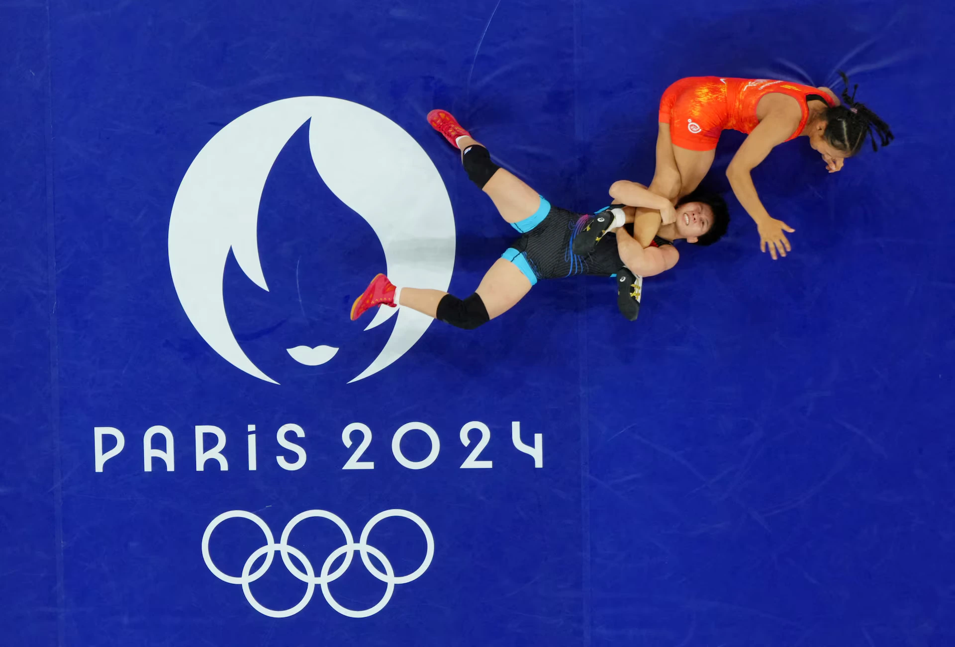
As we look back at some of the most memorable moments, we reflected on the broader Paris 2024 brand identity - how we collectively felt about it when first launched and how we feel about it now after a summer of sporting excitement.We all know a brand is so much more than just a logo; it's a complex mix of strategy, creativity, and a healthy dose of human psychology. And a design system that's only truly revealed when viewed across touch points. It’s the visceral feeling evoked after experiencing the brand in action that comes to mean more to us – what we first hated can become loved, what at first felt odd now feels accepted (think London 2012). With everything new comes a healthy mix of attraction and repulsion. It’s a part of the human condition.
So, in the ever-changing world of brand identity, we decided to pause, take a moment and reflect on a few recent brand identities that have taken us on an emotional journey - from our initial feelings at their launch to our current perceptions once experienced.Swipe below to see our podium finishers and those that came in at back of the pack...
Bronze
Paris 2024 Olympics
When the identity was launched, we saw it in a vacuum. The Marianne icon and the visual play on the Olympic flame was cute but we had no sense of the broader context. The accompanying highly-constructed graphic language wasn’t particularly thought-provoking, nor was it particularly off-putting.
Yet, as the games progressed and with every nail-biting win and head-shaking loss, the identity grew on us – especially those playful pictograms. This identity certainly captured the moment and the visual zeitgeist but probably won’t age like a fine wine (think Munich ’72). Which is probably ok for a brand that lives in a specific time in culture.

Silver
Kia
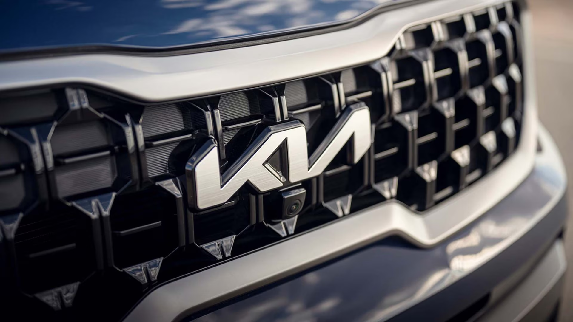
This is a controversial one. What many in the design community claimed was a total flop back in 2021 (evidenced by 30k searches for KN!) now appears to have worked, with record KIA car sales in 23/24. The hyper-minimalist wordmark left a lot of people wondering why they had moved so far from the original - surely all brand equity had been left smouldering by the roadside? But weirdly, the more you look at it, the more you like it. It’s modern, dynamic and we believe brings KIA closer to the electric dream that many automotive brands are promising but often failing to deliver.
Sometimes what is needed is a bold transformation that forces you to reassess a brand. ‘Radical’ shifts perceptions. ‘Evolution’ only reinforces them. Gone is the young, cheap and cheerful Kia, enter adult super Kia – an identity for the future we all need.
For years, the term ‘instant’ has indicated low quality; a quick-and-dirty meal, made with hot water and a soupçon of shame. A serving of ‘almost, but not quite.’But some brave brands are challenging this perception. Asking, what if instant could simply mean fast?What if instant ramen or instant coffee could, perhaps, even be good?Omsom noodles and Little’s coffee are leading the charge, revitalising the world of instant with guaranteed quick quality
Gold
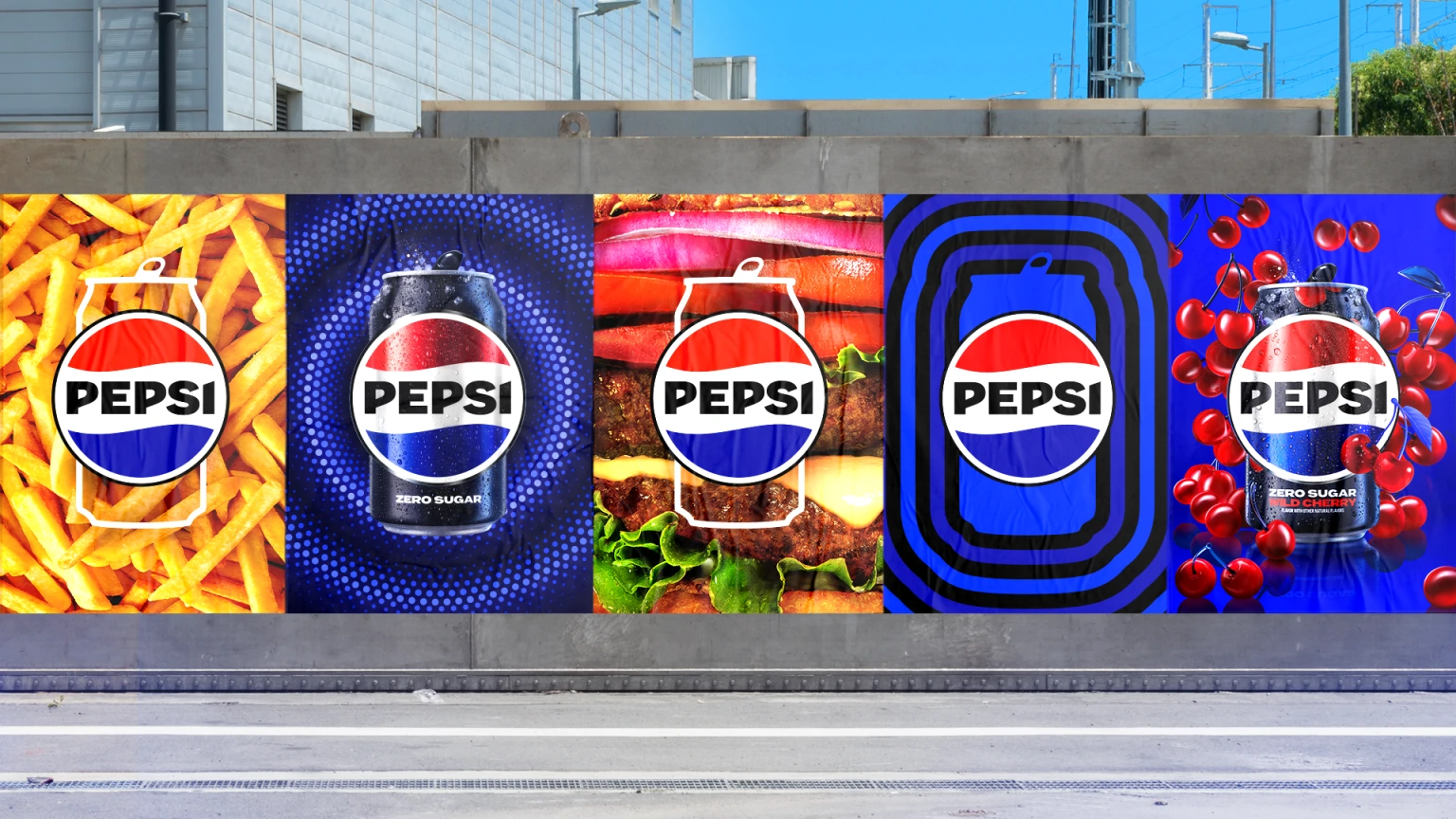
Pepsi
For years, the term ‘instant’ has indicated low quality; a quick-and-dirty meal, made with hot water and a soupçon of shame. A serving of ‘almost, but not quite.’But some brave brands are challenging this perception. Asking, what if instant could simply mean fast?What if instant ramen or instant coffee could, perhaps, even be good?Omsom noodles and Little’s coffee are leading the charge, revitalising the world of instant with guaranteed quick quality
Nice Try
The 'Also Rans,'
Last Place: Twitter to X
Last year, we witnessed the dramatic transformation of Twitter into X. Where do we start? The new toy of billionaire Elon Musk turned out to be more of a wrecking ball. The new name has no meaning, narrative, or thought behind it. The design of the icon is clumsy at best and amateur at worst and the rollout was tragic. The beauty of Twitter lay, not just in its brand identity, but also its distinctive name. The language worked like a charm. You tweeted and retweeted. Now what? Do I say “I will X” or “ReX”? This got us thinking... what’s the past tense of tweet? We think it’s twat.

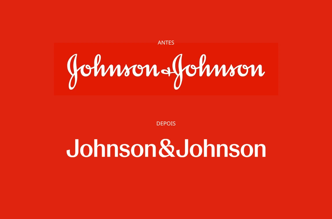
Second to Last: Johnson & Johnson
This one is blandifaction at its worst. Out goes the beautifully crafted cursive logotype based on the signature of the founder James Wood Johnson, and in comes a sterile, faceless sans serif font.We get that everything needs a digital-first approach but surely throwing away 138 years of heritage at the expense of really trying to figure out how something this distinctive could be refined for the screen seems wasteful. J&J were always known as the ‘Family Company’, well, we’re not sure we want to be a part of this new family.
Back of the Pack: Tate & Lyle
We get there might be a problem here... flies buzzing around the head of a dead lion doesn’t scream tasty, but the recent rebrand of Tate Lyle syrup is just sickly sweet. The iconic baking cupboard must-have has been a staple in British households for generations – and I bet most didn’t even see the brand’s Old Testament iconography. Now we’ve got a smiling lion, clumsy filigree and a middle of the road typeface. Maybe they’re moving into selling vanilla.

Conclusion
So, as the Olympics draw to a close and our fascination with judo, racewalking and handball starts to dwindle, we look forward to the next global event that will bring us all together. Some things will change – there will be new winners and, unfortunately, new losers – but one thing remains: the power of branding to connect with customers, capture market share and shape our culture.
Like this or loathe this, we’d love to talk!
Let’s talk about it:
Rach out to our growth director, Andrew Mitchell:
andrew.mitchell@missouri-creative.commissouri-creative.com/contact


Expert Insights To Help You Level Up Your Brand
Discover expert tips and insights to enhance your brand's presence.