Show Me Bitesize: The Unlucky 13
The most overrated design practices of 2024

The design industry is home to some of the most visionary, innovative, and creative people in the world. The work produced has the potential to change how we think about the world.
And at its best, it changes the world itself.
And yet...
Today’s design landscape is rife with trends, fads, and bandwagons.
Sure, they’re hot right now, and when deployed strategically they can be effective in the short term.
But let’s be honest, a lot of trends are over-used and under-critiqued and we here at Missouri would like to see less of them.
So here it is, our 2024 Overrated Design List. In no particular order, our unlucky thirteen eyeroll-worthy design fads Team Missouri is groaning about right now.
Let’s get into it.
2024 Overrated Design List.

01. BORE-thenticity
We love it when brands lie and people don’t “show up as their real selves.” Not.
Social media has commodified authenticity to the point where it’s now hard to find. The endless “real talk” bombs have become lukewarm and predictable.
Grade: B minus – must try harder.

02. Hang the DJ
It might work in edgy streetwear pop-ups, but why are DJs showing up in skincare stores? Supermarkets don’t need a banging soundtrack.
Let’s agree: keep the decks for after dark.

03. Average Joe
New coffee shops think they’ve cracked the code: monotone logo, signature color, industrial craft space. All straight from the same Pinterest board.
Nice, but bland. Especially when the £5 cup is mid and the environment screams blandification.

04. Fauxto Opps
Let’s ditch the fake plastic plants, pink neon signs, and ubiquitous swing seats.
Your Instagram deserves more than these cookie-cutter photo-ops built for bottomless brunchers. Let’s aim for discernment.

05. Doing the Washing
Green-washing. Rainbow-washing. 30-day rainbow logos. “Plant a tree” campaigns by climate offenders.
Either commit to real change and stick to it or don’t bother. The half-hearted attempts aren’t fooling anyone.
06. The Barbie Tax
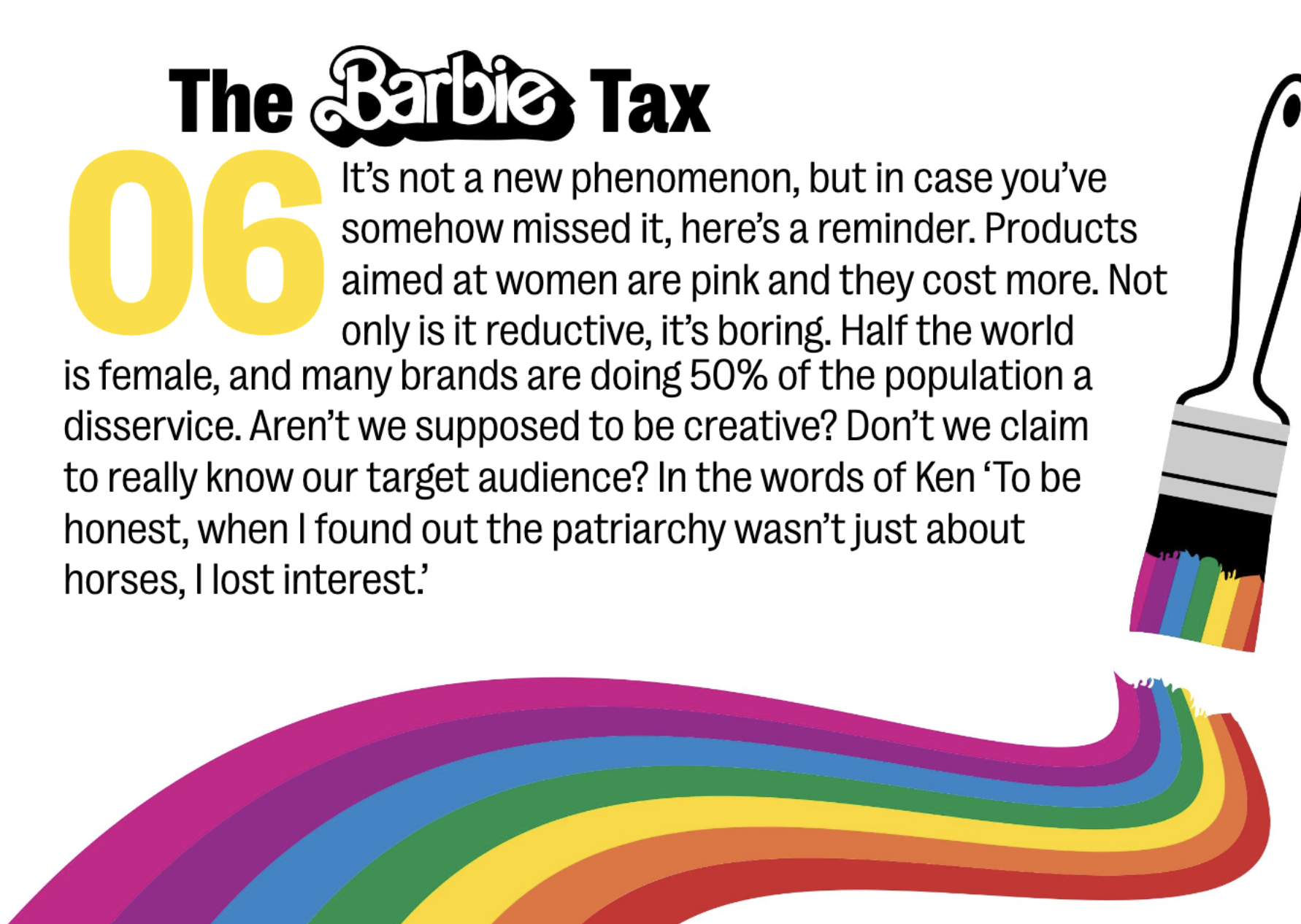
Pink = female. Pink = price hike.
This tired trope is reductive, lazy, and—most of all—boring.
Aren’t we supposed to be creative? Half the population deserves better than this.

07. Is Less Really More?
Minimalism took over packaging a decade ago.
Sans serif type? ✅
Pastel block color? ✅
Geometric lines? ✅
At what point does minimalism become oversimplification masking a weak idea?

08. Love Apple / Hate Apple
Every brand wants the Apple magic. But we’re tired of the case studies.
We love the products—but hate the charger chaos, the landfill clutter, and tax dodging.
Let’s find inspiration elsewhere.

09. I’m Not a Regular Brand, I’m a Cool Brand
“Hey you! Isn’t it funny you’re reading this tiny little ad?”
We get it—you’re quirky and cutesy. But we just want a bank that won’t need a bailout.
Time to get off the best buddy bandwagon.

10. BRND NMS & &
Names that drop vowels. Names that are impossible to Google. Names with & jammed in.
We get it—you want to be edgy and registrable. But Dstnct & Dffrnt just isn't cutting it anymore.

11. Over the Influence
Mike Tyson has a vape brand. Kim K backs toilet paper.
There’s a never-ending stream of celeb-fronted brands with no logic.
We’re ready for the influencer bubble to burst.

12. Gen ZZZzzz
Yes, they’re health nuts. Yes, they love TikTok.
But Gen Z is more complex than brands give credit for.
Stop with the generic insights. Maybe even brief for octogenarians—at least they’ve got money!

13. Messy Mash-ups
Greggs x Primark? Love it.
But some collabs are so disparate they’re meaningless.
Others are so similar they’re indistinguishable (looking at you, Balenciaga x Gucci).
Let’s bring back creative chaos that actually makes sense.
Let’s Talk
If you agree with our list, we should work together.
If you disagree, let’s hash it out (while working together).
Contact:
Casey Shepheard – Strategist
📧 casey.shepheard@missouri-creative.com
💼 LinkedIn
Andrew Mitchell – Growth Director
📧 andrew.mitchell@missouri-creative.com
🌐 missouri-creative.com


Expert Insights To Help You Level Up Your Brand
Discover expert tips and insights to enhance your brand's presence.